Area of investigation


Mise en scene 


Image 1 

American Beauty (1999)

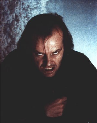
This type of lighting is low-key lighting because the scene shows less amount of light and the man's facial expression is panic and he has blood running down his eyes and nose. The lamp is the light source because it gives brightness which shows that the character is feeling stressed and aggravated. The body language in the photo appeals to what the man is experiencing and mirror gazing. It shows that he is just standing in one spot staring at himself in the mirror looking terrified and confused.

 Image 2 

 American Beauty (1999)

This scene shows the setting is situated and enlightened because the place is created on a rainy and soggy day. However, the man pictured on the side next to his car indicated that he was emotional and unpredictable and couldn't able to call for help. The man is wearing a white top and black trousers which are both wet and dripping. The hair that the man has in this photo suggests that he only has a little hair but is also not too fashionable. The position of the character encourages the man is look in front of himself waiting to see if anyone will see him. The lighting and color in this photo give the impression that the background intends to look dark and spooking night which draws the attention that the man will want to get home quickly. The car is bright red and it doesn't look like someone will drive it soon.


This scene shows that the man is holding a girl on his back. It shows that the man is the main focus of the scene according to the positioning. It also shows that the man has his bag on his shoulder and the girl has a see-through hat on her head. There is an egloos behind them and it's showing fire flame as it looks like it is ready to explore according to the setting. The man shows that he is confused and scared and the little girl is shocked and frightened according to her facial expression. The lighting shows that there is natural lighting. The colors, blue, and green, indicate that the weather is freezing. The costume tells me that a man in the suit is high-level position. 


The scene shows that the man is looking up at the ceiling which tells me that he is expecting rain or bees flying inside. The man wearing some warm clothes like a jumper and trousers and also has his laptop in front of him and this shows that he is hard hard-working person. His hair looks very neat and well brushed and it looks like he has used gel which shows that he is well organised. This photo shows there is a table in the background and maybe abandoned in the forest. It can be a mysterious forest because it's faded and we do not know what is going on in the background. The chair shows the colour is bright which is yellow and there are lots of flowers on it showing that the man is very a good time relaxing in his favourite chair. 


The setting of this photo is based in the city called NYC on a rainy day. However, both characters are inundation and romantic as they share a kiss. Spiderman's costume shows the best personality of the character because Spider-man looks like he has saved the day by helping others around him and keeping the city in safe hands. The facial expression in the photo indicates that Spider was nervous and shocked because he didn't expect that moment to happen from the woman. 


The setting address where the scene was filmed or located is a foggy day because there is a lot of smoke and snog which brings it to the main character. The costume the man is wearing is a black and dark coat and he is wrapping it around himself and it looks neatly formed and well fitting. One of the hair expressions is that the little hair in front is a  bit lined between the eyes and eyebrows. His body language exhibits that he is feeling depressed and displeased because he is looking directly at the camera and feels like he is frustrated at something or someone. the light in some places of the picture is tenebrous while the other side has the same color but more vapor because it shows two different effects of the image.


The setting was discovered in the 1950s or '60s because of how the lady is dressing and it is also black and white film-based. The hair and costume are for the costume when the lady is wearing a modern-looking fashionable dress because it has a pattern and beads on the front. however, this means that the women look very happy and excited to start the upcoming fashion show. Therefore, the hair looks like be shiny and has large loose curls which means that she has added a lot of moisture to encourage a defined pattern, a little fizzy which gives a lot of personality to the lady. The woman is happy and excited because the look on her face shows she is smiling and posing on stage to get the audience's attention better knowing that they are watching her in the spotlight. The lighting and color are mainly black and white effect is used to elicit a feeling of the past. The woman looks like she is wearing white foundation and red lipstick. It shows that the woman is trying is make her first expression.


The position of the characters shows their love for each other by making eye contact and staying furious and outrageous. There is a bedding on the table behind them showing that one of them sleeps in the living room because they couldn't stand one another after the argument. The way they are posing their behavior shows that one of them will leave the scene and be able to say sorry once they are ready. The film looks like the position is pointing at the woman because she is showing action that she can't be bothered.  


Typographic Rules for Magazine Design

  • Define clear entry point 

  • Using the first line indent is to create a visual separation


  • For the indentation instead what we could use is a drop cap that's very easy to set up once again just double click on the paragraphy. and go to paragraphy control and here you will find option drop cap.


  • First of all  align left or flush left is the most common way of setting type and now the main difference between these two is that with justification you get rivers 
  • line length ( measure) to improve the readability of your text, you should always measure your line length, ideally, each of your lines should be between 45 to 90 characters and that includes spaces as well. 


  • Alignment Carefully-  align left is the most common way of setting type as reades tend to read left to right. 


  • Pairing Fonts wisely- they really worked well together. One rule can be to keep X-height the same or similar between the two fonts. So when fairing fonts, try to add contrast, but it's important to align their X-height.


  • All Caps- they all worked well on titles, Heading or even pull quotes, it best to avoid all caps on the body copy as it can  make reading feel very uncomfortable and feel like you are shouting at them.   


National Art Gallery Trip 2023 

ImageI picked out this image from the gallery because the layout makes me think of two people in a boat sailing in the lake. the natural in the daytime makes me so happy as I look into the photo because the colors are bright and unique and match nature. 


Image

This photo looks like a family of three and another group. They looked relaxed and chilling as they had their umbrella. the color is blue like the sea which draws my attention to me because the design matches with the image. The frame is very modern and the edges are very stylish and elegant like the shape of the butterfly.


ImageThe painting that I picked was a woman sitting with her horse like a swan. this really inspires me because of the way the women pose and look up to the angel and the angel looks relaxed and calm showing that she will do anything to protect the woman. the colors in the picture are beautiful and gorgeous and really match her dress and background.    


ImageThis is a photo of the racehorse that was made in 1762 by the artist George Stubbs. As I walked through each room in the gallery, I went past this beautiful painting of the horse that really touched me because the color of the horse is a light brown which made me think I wanted to ride the horse one day. The frame is very impressionist and idealized to the painting because the color matches the background which works well with the horse.  


Image


ImageThe painting of a group of people washing, cleaning, and telling secrets. the image looks like little people are trying to get clothes on but realize that they are taking time to wash and dry the clothes. I really like the way the colors match with the theme because it reminds me of the water drowning down the sink. I think the frames don't match the image because it's very plain and boring so they should have changed the frame or color.


I went to the National Art Gallery with my class and collected many photos based on history. The trip to the gallery was a triumphant achievement goal because we were able to go into small groups and go to each room where are all the paintings displayed on the wall. I will use the photos in the future to reflect back to understand how the history of the past was invented and how it changed in the year 2023. I did have time to take all the photos that I wanted because my group was able to gather a lot of information to use for the project I started with. The most important part of the trip experience was that I collected photos that were very interesting and inspiring because the colors and the people showed their unique styles and expressions which made them very happy and relaxed.   


Auteur theory

What are the rules of auteur theory? 

  • Holds that the director who oversees all audio and visual elements of the motion picture, is more to be considered the "author" of the movie than is the writer of the screenplay. 
  • Technical  competence   
  • interior meaning 


Research own examples of auteur theory in media 

Wes Anderson is an American Director-screenwriter, actor, and producer of features, short films, and commercials. He was best known as the best original screenplay for the Royal Tenenbaums. Anderson has been called an auteur, as he is involved in every aspect of his films' production. His films employ a similar aesthetic, employing deliberate, methodical, cinematography, with mostly primary color. His soundtracks feature early folk and rock music, in particular classic British rock. Wes Anderson met Owen Wilson at the University of Texas, Austin in 1989. they became roommates after sharing an apartment as a result of working on a screenplay for Bottle Rocket together. He was also best known for writing and making the films Fantastic Mr fox, Moonrise Kingdom, and Isle of Dogs.


Ryan Coogler: Coogler first became interested in screenwriting during a college creative writing course, where his teacher recognized his talent for his visual writing and proposed he try writing a screenplay. He has since co-written and directed the seventh film in the Rocky series, Creed (2015) and the Marvel film Black Panther (2018) which broke box office records and became the highest-grossing film of all time by an African-American director. Coogler lived in Oakland until age eight, when the family moved to Richmond, California. During his youth, he ran tracks and played football and also went to a private catholic high school in Berkeley, California, and did well in maths and science. Following his graduation, he was accepted into a three-year program at the USC School of Cinematic Arts where he made a series of short films.


Jordan Peele: his full name is Jordan Haworth Peele he is an American comedian, writer, director, and producer who was known for creating both comedy and horror films and TV shows that address popular cultures and social issues, especially race relations. Peele was raised in Manhattan by his white mum and his African-American father was largely absent from his life. From an early age, he was interested in performing and in movies. At first, he studied puppetry but a class on comedy inspired him and he wanted to encourage people in the outside world to take part in others who were interested in comedy. Jordan debuted as a director with the horror movie "Get Out" (2017) which he also wrote.


Monday 30/10/23 

 Annotate and Analyze a Magazine Cover and Spread


This activity is to find a magazine cover and analyze what is on the cover. I have chosen the cover because it was about the singer that I usually listen to in my spare time. I like it when I pick a cover that is creative and able to guess that you know what is on the cover.


Wednesday 1st November 2023

Magazine Practice using Indesign


I have started to use InDesign to create a practice magazine spread improving any area of the page. During the process, firstly I create a new A4 document in Indesign with facing pages in 3 equal sizes and then select the typography workspace, open the color panel, and dock it on the right-hand side. Select the pages panel and select both pages of the A master. open margins and columns from the main menu bar under the layout and give them 3 columns, increase the gutter to 6mm. 

it was important for me to use the ruler to guide myself when I was using the magazine design spread by going to the menu and getting the ruler visible to know where on the page the ruler can be seen. However, I did find the process a bit tricky as I had to find a way to add my image and move it around the page.  

Lastly, the main thing is that I have to add a text box to edit my text for the title to make the page look like a magazine from scratch which I find okay to do because I moved the text box to the right position.


MindMap/Moodboard For Community 


For my topic, I chose community because the topic is about bringing people together by doing something that will encourage them to keep the community together. Some activities and clubs help people who are too shy to talk to lovely groups of people and this will help them in the long run as they build confidence and more open to others. 
I have chosen the Art and Craft community from the list because younger children will learn more about the subject and festivals where young people ages 6-13 can make different art creative by drawing, painting, and making face masks to help the environment and gather parents and guidance.   


Monday 6th November

indesign magazine practice update 


This week I created an update of the magazine practice that I was finding very difficult but I managed to change things in the end. There wasn't any newly updated expert adding a drop shadow on the side of the image which I found effortless because I used the selection tool and then clicked the fx button in the properties to open the transparency and effects drop-down menu.


Wednesday 8th November 2023

Planning for Magazine Cover  


Mindmap of magazine name for the Art and Craft Community 

I created a mindmap idea of different names that I could add to my magazine for the art and Craft community. From the list, I decided to go for "The Poppy Patch" as my title because it is very pretty and inspiring like the red rose and poppy and people may like to create a poppy or rose in the center. for all the ideas I added to the mind map before, I decided to pick Arts and Craft as part of the community because I think this idea will bring people together and enjoy having a great time. 


Different Typefaces and Styles for my Art and Craft Community 

I have chosen this font style called Bauhaus 93


 I have chosen this font style called Jokerman


I have chosen this font style called Viner Hand ITC


Opening scene analysis

Romance 

The In-Between movie (2022) 

Point: The opening scene of the in-between movie creates an emotional and dramatic scene for both characters after her partner survives a car crash that took the life of him, a teenage girl believes he's attempting to reconnect with her from the afterworld.    

Evidence: In the film, we learn that Tessa is an avid photographer and hints of a troubled past are dropped. In the present, Tessa started to collect old photos while she was doing it. The scene shows Tessa in the woods but she thinks that she is with him but she scrolls in her camera looking at photos of them after he passes away. Then the next minute, the camera angle went in front of her face when she woke up from a coma thinking her boyfriend was sitting next to her bedside. The evidence was that the other car was from the other side of the road concession. 


Explanation: The scene slowly reveals that the character Tessa will do anything to get memories of herself and her boyfriend. She will keep the camera in a safe place where she can edit the photos by introducing a character, her boyfriend Skylar wants to see her face to notice if his girlfriend will notice her and her facial expression. It shows the setting that Skylar was wearing cute and pretty outfits like a lilac sweater, grey coat, cool and inspiring plots(camera), cars, and printers. 

The impression of the character Tessa is that she is very upset and can't move on with her life without her boyfriend who passed away recently. She couldn't stand up t for herself when her friends and family were asking her about the loss of her boyfriend. Skylar was talking to Tessa through her mind dreams because Tessa thought he was actually with her in person. The setting of the film was set in a forest where Tessa and Skylar were sitting under the tree enjoying the wind. 


This is a full shot and close-up of the characters where Tessa and Skylar are showing the expression of their love by doing a slow dance with bright and sunshine light and moving uniquely and romantically.  

Exposition: At the beginning of the opening scene, it is set in the kitchen meaning that the couple is doing a slow dance emotionally given the fact that they want some peace. This is presented through the characters finding the situation very calm and relaxed to get into the background music. However, the two characters are trying to communicate with each other through their minds without any noise. we can see that the camera is focusing on Tessa and Skylar because there's a bright reflection coming from the window directed toward them.

The Perfect Find (2023)

Point: The opening scene of The Perfect Find creates a high-profile fashion career that collides with a secret romance where the scene shows romantic comedies and is less perfect than a serviceable with a few high points.

Evidence: in the film, staying home for years Jenna Jones becomes a fashion editor who recently hit a major role in the top after she broke up with her boyfriend. We have a full shot where Eric and Jenna sitting next to the table having a connection about their futures together if she would want to be a fashion editor forever. One shot moves from the table scene and Jenna in the office that her passion for her work shows that she was able to do it. Her creative collaboration with Eric could provide another lens through which to view their relationship. After that, it is a sweet scene between the couple, the mid shot draws attention to the fashion editor Jenna.

Explanation: It slowly reveals that Jenna was wearing a pink flowery dress to express the feeling that she always wanted to become a fashion editor where she could teach other designers to display different designer clothes. Jenna shows so much encouragement and motivation in her design to make the effort to show the judges and producers her amazing dress and other clothes that she had created before. Jenna couldn't be happier and more excited to move to the next stage of the show so that she can nail her comeback and be able to have a better life.


The film is set in New York where the characters Jenna and Eric meet and Jenna is told that she is a fashion editor and the look on Eric's face gives the impression that he is very pleased and excited for her next journey. the photo below shows two characters falling in love in the city of New York and the shot is close up which makes the couples draw attention toward each other because they look so happy and emotional as the background shows beautiful and glowing lights while no cars are passing. 
The film shows that the action toward the characters are very calm and smooth which give the idea that Jenna and Eric would run back into each other's arm when they are ready to date again. At the end of the opening scene, we are introduced to Jenna when she is wearing a white dress with a pattern in the set of the photoshoot.


Exposition: In the opening heading, we appreciate that the scene was created in the city of New York and get the audience to know the behind-the-scenes of the story. As Eric and Jenna meet, we can see that the camera zooms in on them. we can also see that when Jenna was in the photo shoot area while other photographers were taking her photos. The writer is showing that other characters in the scene are very pleased and delighted for the main character Jenna and how they are so pleasant and contented.


Purple Hearts 2022

Point: The opening scene of Purple Heart develops a situation where Cassie Salazar and Luke Morrow couldn't be more different from each other. A sharp-witted Cassie works nights at a bar in Oceanside, CA, to make ends meet while pursuing her dream of becoming a singer/songwriter. The movie portrays Cassie's struggle of not being able to afford her insulin as she has type 1 diabetes and Cassie and Luke decide to get married for military benefits. 

Evidence: In the film, Luke and Cassie decide to have a discussion about her boyfriend going to travel the world for the war to protect the country. But Cassie was feeling disappointed and worried that her boyfriend would not make it back on time. She thinks this is a bad idea that she couldn't let Luke decide what he liked to do in his life it wasn't her problem. Cassie went to the club to perform a unique and beautiful track called "Sweet Caroline" to demonstrate the feeling and movement toward the audience for them to embody the feeling in their bodies.

Explanation: The scene discloses that Cassie wears a white crop top and blue jeans to express her look and experience when she is performing on stage. The way she engaged with the audience by slowly shaking her head to get the smooth music out of her head and connect with the people in front of her at the concert. this introduces a character called Luke wearing a soldier uniform and large boot giving the way luck dress and getting ready for the war.   


Purple Heart film was set in Oceanside, California creating the fact that Luke and Cassie meet in a club while Cassie is performing a song on stage. Cassie is a waitress/bartender and performs with her band, The Loyal at the bar in America. Diagnosed with Type 1 diabetes six months earlier, she struggles to afford insulin and works multiple jobs to try and make ends meet. One night, she serves a group of marines who are soon to be deployed to Iraq. The message is about promoting moderation and centrism so that two individuals can come together in love to listen to and encourage each other's points of view. 
in this photo, Luke tries to help Cassie get through her diabetes so that she will be stronger, and it is a close-from the two characters where Luke has his hands over Cassie while she is worried and distressed really gives the thought that she is really sick and there is no time. 


Exposition: When Cassie went to the club, she had to perform her own song while in place there was a load of people walking around the area with food and drink on top of their hands serving to customers.  we then learn that the writers that Cassie plugged her ears with music playing through her headset because she was feeling the music and dancing at the same time. Cassie was definitely enjoying herself, having fun, and talking to new people. The writer explains this attempt to add a more romantic and beautiful storyline to bring two people together for the first time.


Binary Oppisode 10/11/23


Creative Magazine Designers Research

Cipe Pineles
Cipe was the most popular designer of the twentieth century and one of the first female art directors to work at a major magazine. She was succor in that capacity at Glamour, seventeen, and Charm. She started her career at age 23 at Contempora after struggling to enter the workforce due to sexism in the industry. In 1932-1936, she became an assistant to an Art director called Dr. M. F. Agha who worked in Conde Nast Publication. After finishing her work at seventeen, she began her career at Charm, a magazine subtitled "the magazine for women who work. The magazine recognized that women held two jobs: one in the workplace and one at home. There would be no room for Ms. Magazine if Charm had not been dropped. "Similar to her work in Seventeen, Pineles worked her interest into the element of Charm. She planned the number of four-color pages, two-color pages, and the general pattern for the issues themselves.

This magazine was created in March 1953 and from 1950-1958  Helen Valentine developed Charm as the first American fashion magazine targeted to women. I like the magazine design because the woman posing with her hands in her pocket gives the expression that she is trying to get the audience to her work and be able to buy a copy of the magazine.  I think the design is very inspiring but it needs more colors in the background to make the cover engaging with the people who want to buy her work and know more about it. I dislike the background of the magazine because it's very plain and maybe it would be good if it had color to give the appeal to the theme. 


The Seventeen magazine was created in 1947 and it was created to aimed to inspire teen girls to become model workers and citizens. However, it soon shifted to focus to a more fashion and romance-oriented approach while still emphasizing the importance of self-confidence in young women. I like this magazine cover but my favorite one is Seventeen where Cipe Pineles sits on the beach its was very original and unique blending with the tone of the theme as she is enjoying the weather and relaxing on the beach.
I think the purpose of this magazine is for older women and it promotes fashion and designers because you can see the way her images are displayed with different patterns on some of the magazine covers whilst other covers have bright and glittering designs.  


Magazine Cover Extermination 


I have two ideas for my magazine cover but I am going to change the cover to something different as the main image. for my main image, I'm going to use my own time to go up to the art room in college or outside of college to collect my original imagery.  


I have created two magazine designs that I can use one is the title, barcode, and main image. Overall, I made a change to the design by creating space at the top to able to add the title. In Photoshop, I used the spot-healing brush tool to remove the dirt in the background where I took the photo.


Good Magazine Design for Art and Craft 


I have chosen this magazine cover for art because the design is very engaging and catchy as the young boy has a red slimy snake around his head and face giving a dramatic look to his face that he could see where the arrow is pointing to. I really like the font style of the main logo because the letters are close together to stylishness and intelligence showing the main logo for the page. 

The Communication Arts Illustration cover has a very dark colour mostly red which can be spicy and evil because on his head there is an apple giving the impression that the person on the front page was very tense and pressured giving a wicked look.


This is another good magazine design for art and craft because I like the first two words at the beginning where it shows "Create Art" as it is old English style and the rest of the title has different font styles which are unique and realistic because the design is very attractive and colorful which make the audience want to buy the magazine.  

As you can see there is a photo frame of the colorful and stimulating leaf pot which makes me think of the rainbows with all the bright and outstanding colors making me very happy like I would buy the cover from the store.  


I like this magazine cover of Cross Stitcher which is very creative and visionary because there is a load of great designs like a bread house, a two photo frames one is a car with presents at the top and the other is a tray with gifts on top showing the passion of art and how works art really is in different ways.

The visual elements are texts and images because little text but more images give the concept of art and craft by giving people the chance I like the origami with the deer walking through a snowy morning and the bird singing. 


Magazine Spread for Art and Craft Experiments 


I have made a magazine spread about arts and crafts where I add my own information and photos together in one spread. I did half of the spread this Monday and I will finish the rest of the spread later this week.


Updated cover, spread, content page 22/11/23


For today's lesson, I created my content page and spread it by using InDesign. For the most part, I was struggling at the start to see if I linked the text together. Overall, I was able to sort out the problem by adding new layers and unlinking the layers to get them separate. I used paragraph styles by highlighting the text to keep the same font styles for every text and it really helped me by using a guide so I will able to learn the process for next time. I used a style drop cap to increase the first letter at the beginning to get the text noticing that it is the start of a paragraph.


Magazine Spread Experiment for Arts and Craft


Opening Scene: Idea Generation 23/11/23


Script/Narrative

Alice: hello, my name is Alice nice to meet you I'm 16 years old and I love art and my dream is to go to UAL art school what about you?

Vanessa: Oh hi Alice, very nice to meet you too I'm also 16 years old and I love art and I'm going to the same school as you after two years. 

All: Shut up no way, we both going to the same Art school and  we will be great friends  

All:  They screamed 

Alice: Would you like to pair up with me for the presentation that will be introducing to the class?

Vanessa: I would love to as I think our speech will be amazing compared to other people in the class don't you think.

Alice: I definitely think it will be as they are so close friends and we can prepare a better and more interesting work for the class. 

Vanessa: Should we go to a library and start putting ideas in one to create an outstanding presentation so we can both go to the same school.

Alice: Of course, I know the teacher will give both of us good grades. We need to make sure the art design is priceless.

Miss Munro: Are you girls ready for your presentation and what did you pick for the topic in Art?  

Vanessa and Alice: Yes miss we are ready to present, let us get things ready and we will be right back.


27/11/23 
HTML and CSS


I used Dreamweaver three years ago when I was doing IT at the same college. I was very familiar with this process because my old teachers used to teach me how to use coding. I added a Santa image by saving it on the file orderly to work on the software. I was very pleased with the result as it was very fun and interesting to do. I got the photo of Santa by saving the image on my file from MS Teams. Then I have to create a folder called my-basic-web orderly to save the work inside and if I didn't have done it then the progress will not work and appear probably on DreamWeaver. I used so much coding by using <body> and <head> and then adding the code with the background color. So I clicked the side of the software to see if it appeared on the screen which was very enabled.

29/11/23

Final magazine Cover, Spread, Content Page


I improved the spread of Art and Craft by adding the page number, main title, and date. I was able to add a slogan in the middle between the two pictures and I added a quote at the end of the text.


I was able to experiment with the skills by using text boxes for the main title and subtitles. I improved my skills by changing the color"white" for the text so the statement could stand out. As you can see, I arranged the texts and images around the page so it will be easier to read. Overall, I was happy with the outcome of the cover because the changes were a success everything turned out amazing in the end because I used Preview to use the view of the cover to see if it was very different, and in the end, I was able to make the cover even better for people to read. 


For the content page, I have improved the page by adding an image for the other side of the sheet and even the same side. I was able to add numbers a main text and my master head. I also have to change the font size to exactly the same throughout each subtitle. 


Opening Scene Week 3 Dialogue Recording 30/11/23


I created a dialogue recording on my favorite quote from Dhar Mann which was very inspiring. I  added the clap at the right time within the tone of the speech to balance the voices together.  On the green boom mic recording, there is no echo in the camera whilst in the blue dialogue recording there is an echo and sound that doesn't seem nice to listen to as it's very disturbing. The boom clap makes the sound louder at the right time within the sound recording and the video clip so it can all sound perfectly fine. I have used Premiere Pro before because I was able to edit the sound and recording and use the razor tool to remove the part that I didn't want. I also edited the part with my video recording and sound and I couldn't able to continue with the rest. However, I did the best that I could do by waiting for the sound to come exactly with the clip so it could go smoothly at once.


Soundscape Planning task 30/11/23 


Friday 8th December 2023


Planning for Opening Scene Storyboard Sheet

Image

 I have created my plan by drawing the storyboard and reimagining the scene to place the shots and camera angle for each frame.


Media Risk Assessment Record


I have planned out the risk assessment on where I would film my scene for the arts and crafts community.


Call Sheet Template 1


I have gained all of my information together to run the scene. And I have only created three scenes and the title is Crafty Girls.


Location Recce


I have gained information for each section and I thought of different locations around the college. I also made a list of safety hazards in the college.   


Shot list sheet


I used this template for each shot of the scene and wrote different shot angles, and camera movements for the scene. 


Magazine Evaluation 18.01.24 

To create my magazine, I used InDesign to develop my cover, spread, and content page. I split the pages into three columns for the spread to add information about my chosen topic. Then I used guidelines by pulling them from each edge to bring it to the pages and then planning to make the design so that the guidelines would go away and export the file. When I was creating my cover, I made a mistake by using the wrong color with the background. However, I had to make some choices of colors that could suit the layout of the cover by arranging the text around one place where the flower was that could blend in and make the cover very beautiful and creative. The mistake that I made when creating the design was that I only wrote page numbers on its own but did not number the pages or position the titles in the right place.
The Tools I used to create the magazine were: Gridlines, rulers, The selection tool, the direct selection tool, and placeholder text to delete and add my own text. These are the tools I have found very useful and knowledgeable because I have used the tools and gotten better with them as I was learning and making processes along the way.  

What I liked about my final design was that the cover was that they show the motivation of the art and craft. I really like the photo I took for the cover because the design suits the theme of young children with lighter colors like pink, purple, orange, and blue. I like the chosen title of the art and craft as it shows the impact of young children ages 6-10 giving the idea that children would like the magazine and how it was designed. I think that the design suits the target audience because children like colors that are bright, vibrant, and vivid appealing to them to be happier. I used the same font style throughout my designs to able to know that I don't need to keep changing the style of the text. What I need to improve next time is to make sure the color of the background will be to find the right color text for everything. 

In Conclusion

I think it went well but also there were some mistakes so I made a plan where I was able to get information from the internet. I had to make some new magazines because the original design wasn't working for me as I kept moving things around and making the subtitles bolder. I also collected some original imagery photos for the magazine which was last minute but I managed to take photos in the limited time.  I had the experience of using InDesign before and the skills I developed were a success because I reflected on the recording and noted down some ideas on how to create the magazine amazingly. At the beginning of the magazine, the title and text were a different font sizes the main text was supposed to be 11 and the title was supposed to be 20 pt I think. for the magazine experiment, I used gridlines showing where to put the text and the gridlines shown on the page before I made a final piece of the cover, spread, and content page on what I have done so far. The content page is mixed with both images and some number text and the page is creative to make with original imagery and different font styles to adapt to people to know the similarities and differences.
If were to repeat the process again, I would make time to add colors to the content page that goes with the theme of art and craft. However, I don't need to rush it through or it would be confusing as I may have to change things around or the layout of the pages. 


Homework: Best opening scenes-26/01/24

My Rough Cut-08/02/24


I did a rough cut of my video on Premiere Pro which lasts for 47 seconds with some soundtrack and transition at the beginning and at the end. I will change the content a bit more in my spare time and make an updated version of the video.


These are the soundtrack /audio i used in my opening scene:


Opening Scene Evaluation 

My final piece of my opening scene was about two girls meet for the first time in an art room.They both picked the same course and discuss when university they would go. Before that, i did a plan and recording how many minutes long the scene will be by using a templates. I was able to make plans that lead up to the scene when i finally recorded the clip. I didn't record my ideas to others because i though that its won't be good enough for the audience.
The good thing that went well was that two people my friend Mia and my classmate Hayden was able to take part in the opening scene. because if its wasn't for them to join in, i would be very upset and that its make me fail the unit. I think that i used the same script  to record the perfect scene which was very inspiration. The Software i used was: Premiere Pro that i edited with to make my opening scene video and i also used the Red text for the main title that represented theme of art and craft and the flower Poppy. I also used my own soundtrack called Free-beat-free bgm and Tuesday Glitch-Soft to have a upbeat tune when the scene shows two girls being so happy after being great friends. 

When i was recording my scene, the camera quality was effective the scene and i could have made the scene a bit longer for a better view. Then i upload the clips on to my computer but sadly, i could make a longer video clip as there was no time to make the change. This rough cut video was a example of what its would look like in real life because if i have planned myself probably then its was a simple video but everything was a rush to me as its wasn't planned as i though it will be.  I feel very disappointed that no one didn't wanted to take part a role in my scene but mange to record the scene at the end.

However, the rough cut was a struggling to find the right lighting because the lighting in the video was a bit dark because i think the camera was not good enough to capture the content. I had to take many shots of scene as possible when i was recording to see which one is better from the video i recorded to make a better short video. I don't think the video was exactly how i thought because i was not expecting that people would let me down when i was trying to ask them if they would want be part of my opening scene. The camera faced a long shot like a distance from the camera to the art table so that i can zoom in and out as i added into my planning sheet.

If i have made a improvements with my opening scene, i would have change my area of investigation to community within family or church which would be simple. This is the reason why that i would make a video of my family as part of community. It would make a difference and improved with my work and create a 5 or 20 mins documentary video of my family life. 


Definition of Different Sounds: 
Diegetic sound: it is any sound that originates from the world of a film. If a characters can hear it, it diegetic.  Dialogue is one of the primary sources of diegetic sound, but diegetic sound effects range from doors being slammed to cars passing by. 

Non - Diegetic Sound: is quite the opposite sounds that don't come from the story world. These sounds  don't appear in the character's sound environment, so they won't be able to hear them. It often used to show mood, present a clue to the audience or tell them something  directly. 

Soundscape Research 
A soundscape is all the audible sound within a specific area. Soundscape can change based on your location. This is because there are different environmental factors and natural sounds that are combined to create that specific soundscape and what you can audibly hear. An acoustic environment is a combination of artificial and natural sounds within one area. The sound design can often be heard in storytelling audio.
  
Soundtrack 
The soundtrack of a film does include the music, it is not limited to that. In fact, the soundtrack compasses all dialogue as well as ambient sound and sound effect basically all of the sound in a movie.the soundtrack that reaches the general public in the fact a composite track of several tracks that were recorded independently, such. as dialogue track, sound effect track and music track.   

Foley Sound 
Foley is a word  commonly used in the filmmaking world and refers to the use of everyday sound effect that are added in the post production of films, videos, or other media to optimize the audio quality. Foley sound is named after the creator of the art form- Jack Foley, Back in the 1920s. the reason why it is important is that it help to create and set the mood and atmosphere of a scene. you can see if you notice sounds are missing, or that they don't match up with what you're watching. Then you will be removed from the moment. 

ADR- Automated Dialogue Replacement     
One of the reason is it just one phase of the post production process. This process replaces dialogue recorded on set with dialogue that is recorded in a studio afterward. ADR in film usually happens after the film is edited and after the dialogue editor has lifted through the on-set audio to have a list of cues for the actor to perform. this is most often ADR is done to get a cleaner recording of a line that is due to a reason such as background noise like a passing car or for creative reason  example to fix a performance.  


Contrapuntal
Contrapuntal sound in film refer to the use of sound element that are in contrast or contradition with the visuals or the main sound in a scene. These are sounds that are used in conscious contrast to the action that is being shown on the screen. Bring back to the example of the romantic kiss we spoke about earlier, using different sound to the ones that people would expect to see can have dramatic effects on people's emotional response to a scene.  

No comments:

Post a Comment

About Me!

 Who are you? My name is Chantel and I'm studying Level 3 media at Stanmore College. I'm in a family of 6 with three sisters and we ...