13th September 2023 -
Annette
Adobe Illustrator _- Am cassandre
My new update
 |

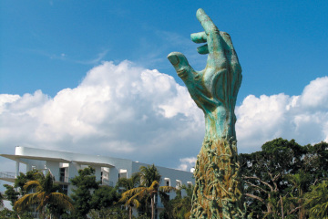
Well, i picked this image of AM Cassandra because when i looked at this image, it make me think of the titanic ship. I like the look of this image because there is only three dark colours and it's doesn't have any bright colours. Also, this image is very simple and creative even with three main colours to catch the audience's attention. I think the image is suitable for this practice because I like this ship as it sails in the ocean. However, I can see that the text is French. For Illustrator, the tools I used are a pen tool, straight lines, shapes, colours and layers and mask and gradiant tools to blend the black colour together and i change the old version to expand to the advanced of the original image. I found created this poster was very fascinating because i was able to move around the shapes and the use of the colours was mostly dark because the original picture has darkened but a few of lighter background.
AM Cassandra
Cassandra was one of the great poster designers of the 20th century. He originally studied painting at a school in Paris. At the age of 22, he started designing posters under the name Cassandra. He was born in the Ukraine and moved to Paris when W.W.1 broke out with his French parents. Cassandra believed "the Artist expresses himself, but the designer does not- his job is to communicate messages. He was successful, he worked for Harper Bazaar, Yves St Laurent and Olivetti, he was a partner in an advertising firm, ran his own school of design and taught at the "Ecole des Arts Decoratifs. To support his own living, he discovered and took advantage on the poster for advertising.


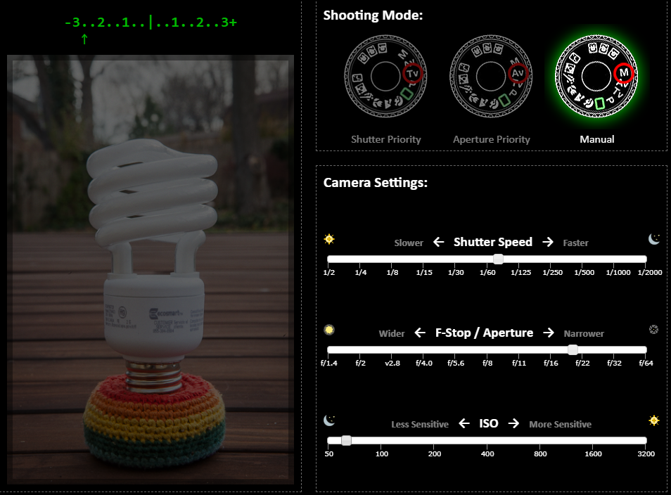
This was shot with Manuel mode, shutter sped 1/60 aperture FS 20
This image is narrower for aperture as the light is much darker which blend the tone of the image and the ISO is very light and fewer colours.
The image is over exposed and blurry and the depth speed is more lower than higher.

I decide to change the setting with Aperture Priority/ F-stop to F/20 whilst as ISO is more sensitive 1000 which the image is more brighter but not quite. I also didn't use shutter speed 1/200 because i just use F-stop and ISO section.

This shot with Shutter Priority, Shutter sped 1/10 but no F-stop/ Aperture. ISO is 3200 which is overexposed- white so I can't see the subject properly.
Camera Basics/Definition of: ISO, Shutter speed, Aperture, Depth of field, White Balance, Frame Rate and Focus modes: 19.09.23
ISO= For Photography, ISO refers to the sensitivity of the camera's sensor. The setting is one of three elements used for to command exposure: the other two are f/stop and shutter speed.
White balance= it is a camera setting that institute the true colour of white. This produces a baseline from which all other colour are measured. White might not appear "white" under all lighting conditions, so this helps correct it.
Shutter Speed= shutter is exactly what it sounds like, the speed at which the shutter of the camera closes. A fast shutter speed creates a shorter exposure. the amount of light the camera takes in, while a slow shutter speed gives the photographer a longer exposure.
Aperture= In photography, Aperture a hole within the lens through which the light travels into the camera's body. The larger the hole, the more light passes to the camera sensor. Aperture also controls the depth of field, which is the portion of a scene that appears to be sharp. If the aperture is very small, the depth of field is large.
Depth of field= In photography, can be discovered as the space in the image that is relatively sharp and I focus.
Frame Rate= the frame on the camera is rate when the shutter opens and closes or its can be sensor which captures video during one second.
Focus modes= A camera 's focus mode is the main thing of either autofocus or manual focus. This can change by a physical switch on the camera, labeled "AF/MF" or on a dial and/or button.
Composition Photography
Worm's eye view


The hypodermic syringe theory
Hypodermic syringe theory were one of the earliest ways of thinking about how the mass media influences audience. It suggest that the media injects messages into the audience who passively accept these messages without challenge. The theory was developed in 1920s and 1930s after the researchers discovered the effect of advertising during world war 1 and events like orson's war of the worlds broadcast. People believe that the mass media has a powerful effect. Parents worry about the influence of television and violent video games. News outlets run headlines like " is google making us stupid and 'Grand Theft Auto led teens to kill.
![JTC 501 - Communication Theory [licensed for non-commercial use only] / Flashcards Instructions](https://jtc501.pbworks.com/f/1314301615/hypoderminc%20needle.png)

Two-step flow Theory
The theory states that most people form their opinions under the influence of opinion leaders, who in turn are influenced by the mass media. I think that one step flow of the hypodermic needle model or magic bullet theory, which holds that people are directly influenced by mass media. According to this theory. people communicate with a social group that are considered opinion leaders. A example of this theory is Fashion magazines where they act as a opinion leader telling their readers what is the next seasons trends are.
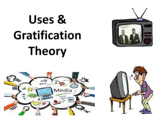
Uses and Gratifications Theory
Uses and gratification theory is developed by Bulmer and Katz suggest that media users play an active role in choosing and using the media. The theory have a choice of choosing what they want to watch for some reason Example: who is the best contestant on The X Factor who which was the best goal shown on Match of the day. They are the encouragement to select the media that they want in order to gather the different type like personal identity, entertainment and personal relationships. For example people uses media for entertainment purposes. They watch movies and Tv shows or listen to music to relax and escape from their daily routine.
Cultivation Theory
In most recent time, researchers have search into other forms of media such as reality tv and video games to study the effect. George has introduced the theory in the 1960s as part of the project inspect the influence of television on viewers. Children who watch commercial tv have notably more stereotypical views of women and men than children who don't watch commercial Tv. The amount of time people used media rather than themselves shows that they are compulsion and can not get their hand of their devices like phones and laptop. They are more likely to imagine to what they are seeing preceding of them accounted for that media as a reality. A example of the theory can be videos games or tv shows where its has crimes and violence: Red Dead Redemption 2. It can also make them not bale to do daily things in their space time as they are fascination.

Wednesday 20th September - Annette
Photoshop Practice

How does resolution affect image quality and size?
Resolution is affect the image quality and size the higher the rows and columns, the image size will increase and also the file size will increase too. The highest resolutions means that there is more pixels per inch, resulting in more pixel information and creating a high quality, crisp image. If the PPI image is lofty when you purpose into the image, the picture would be more clear alternately than if the ppi in the image is low, the quality when you view in will be confusing.
Also, the size of the image also be important part if the ppi within the image is insignificant than the size of it will be also be big. An example of this is when the PPI in the photo is 180 ppi than the size of it would be 10.4MB. Although, when the PPI is the smallest then the size would also be small 72 ppi size would be 3.8 MB.

What are the differences between these?
Jpeg stands for Joint Photographic Experts Group. This means that digital cameras compress raw photographs as JPEG images to make the files smaller in size. Where as JPG file is a commonly used method of lossy compression for digital images, part for those images produced by digital Photoshop. People also use the JPEG format in emails because it's response more faster.

PNG is short for Portable network Graphic. this means the file is a type of raster image file that is commonly used on the internet. Png files are lossless which shows they have a fixed number of pixels and doesn't lose any quality when they are compressed.

GIF is an image file format commonly used for images on the web and sprites in software programs. However, this clip is used to send funny memes through phone text messages or computer which ca be used for animated design or sketches. There are many colours on Gif would mostly be flat colour format size are usually appressed. It don't take much space as it is easier to send.

SVG( Scalable Vector Graphics) is used for logos and graphics as it's can be zoomed in and out for different reasons which make it simple. However, it should not be used with images that have a lots of information which cannot inclusive it.

If you have pictures with a range of colours then you should only use PNGs or JPEGS as Gif doesn't go well with it. PNGs are always used for images that contains text or screenshots, charts and illustrations.
Add example films to the genres.docx


My Ideas for an Event
- Dance
- Award ceremonies
- Karaoke
- charity event
- Sport
Ideas for photographic and graphic poster
- Photoshop for poster
- Illustrator for poster
- Indesign
- take my own images

Presentation of Ideas


Instagram Header:


My old photographic social media header


New versions of the photographic posters and social media headers


Texture
This photo of the elephants shows that the subject is focusing on the eye. As you can see there is lots of texture, rough, pitted. This photo of the elephant feel so anxious and scared as you can see in his eye and he feels like he is stressed and panic stricken.

Pattern
The image looks like the pattern is always a repeat so when someone is walking on the path. There are yellow leaves on the ground which blow the way that the leaves are falling from the tree. The photo is a bird' s-eye view. There a colors in this photo yellow which make the floor pattern more inspired.

Line
The photo of the dog is running to the end of the bridge. But you can see clearly that as the dog is running the line within the image is captured because the line is speeding in one straight line. the image is also a long shot.

Form
I can see that the photo shows that the light is bounced toward the subject and reflecting toward the window of the building. The image looks like to is a work company as there are a lot of windows which is a good way to know what the image really is.

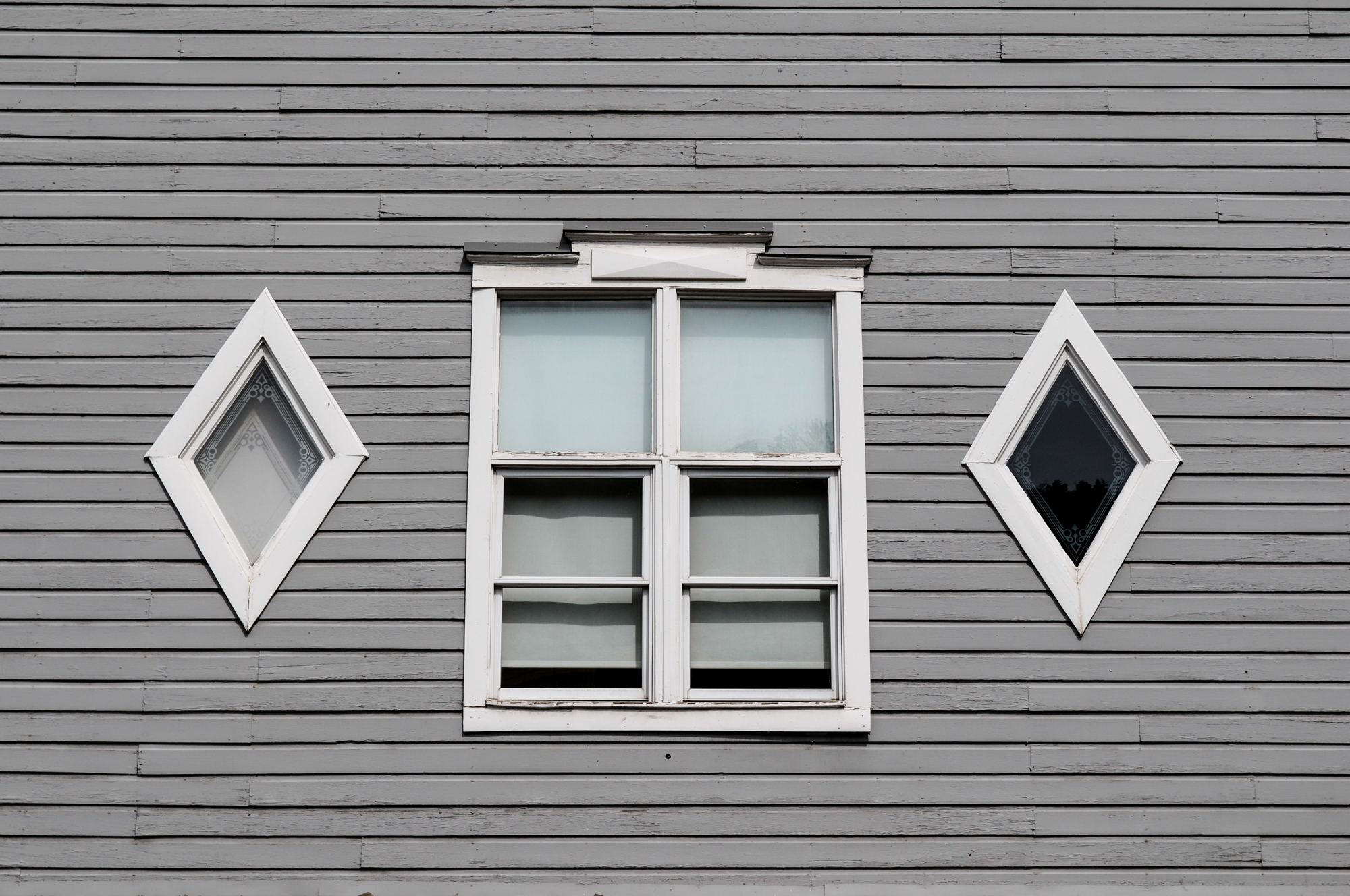
Shape
The two-dimensional appearance of objects as they're captured by your camera. If you look at an image of a ball, you'll find its shape as a circle. Likewise, if you look at a picture of a cube-shaped window, you'll find its shape like a square. This image displays shape as the shape of the diamonds is next to the main rectangle windows where it looks like they created the house. Although, the shapes look outstanding from the outside.
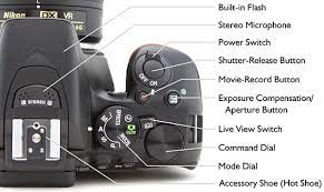


I completed the worksheet for the Camera License test to understand the camera better and take better photos. In the worksheet, I found "White Balance" the hardest because it is about adjusting the color of the white according to the lighting and I wanted to learn how to adjust the light in the right area of the room.
I should practice more and take more images to get better at using the camera in all aspects of the camera. I also need to learn auto-focus and manual focus because I should know how to move elements in my lens to keep the image focused and this is what I need to learn and look back to. I think I should learn how to use a camera and memorise the names of each lens and button on the camera.
Definitions of camera-mounted flash lighting, background, fill light, hair light, key light
Camera-mounted flash lighting: a compact, battery-powered light that can be mounted on the camera if the photographer or videographer chooses. On-camera flash units also tilt and turn, which will allow you to bounce the light on another surface. Some photographers prefer using off-camera flash units. you can use flash to create the foreground while keeping the shutter wide.

Background
When there is too much light, sometimes your background can turn out too dark. this is where the background light comes in handy. Background lights can also help eliminate shadows cast on your backdrop by your subject. This light is most often dimmer than or equal to the power of the key light.

Fill light
This light is used in conjunction with the key light. The fill light is a style of lighting that is often used in theater and film as well as in photography. when you are using fill light, you have to be careful using the lenses. the key light is the main source which can be the sun whereas, the fill light is a light source that fills in the dark areas on the subject.

Hair light
These light has different names depending on if the subject is a human or an object but they provide the same purpose. The closer your hair light is to your subject, the more narrow the highlight. so move your light further away from your subject if you want it to hit a slightly larger area. An example of hair light using a hair light is shampoo or hair color. You can either a flash or a continuous light source to create a hair light. you can even use the sunlight, but only if you can investigate the only person's hair and maybe the shoulders.

Key light
This is the first light usually the most important light that a photographer, light cameraman, or other scene composer will use in a lighting setup. The purpose of the light is to highlight the form and dimension of the subject. Any other lights used will acclaim the work done by the key light. This light is often placed to one side and pointed directly at your subject.

Definition for each style of lighting: split, Rembrandt,Butterfly, loop, broad:
Split light
This setup lights up half of the face while keeping the other half shadowed. you split the lighting on your subject's face. To create a split lightning portrait, the photographer places the light at a 90-degree angle to the left or right of the subject, which casts a light on the subject, split down the middle.

Rembrandt
This places your subject slightly more than 90 degrees away from the light source. One side of the face will still be in shadow, but one triangle of light should fall on the cheek, no wider than the eye and not longer than the nose. Rembrandt's lighting will draw the viewer's attention to where the light triangle is from.


Butterfly
is a portrait lighting pattern where the key light is placed above and directly centered with a subject's face. The technique is achieved by placing a light source at a 45-degree angle to the subject, slightly above the eye level. I can see that butterfly light differs from the loop lighting where the nose shadows fall onto the subject's cheek. This can also cause a shadow under the subject's chin where both shadows are evident.


Loop lighting: is a lighting pattern that creates a circular shadow on the subject's face under the nose. you can achieve this by placing the key light 45 degrees to the side of the subject and raising it just above their eye line. The circle or 'loop' shape that sits just below the nose is on the opposite side of where you place your light. loop lighting is the common setup used in portrait photography.


Photographer Research
Steve McCurry
Steve McCurry is a photographer who has taken photos related to the war genre. He started photography when he went to university to achieve his degree in theater art after two years he went so many trips to India where he met lots of people. he also traveled with more than a bag of clothes and films and made it across the world with his camera. after several months of travelling, he crossed the border into Pakistan.

I like this image because the photographer Steve is standing next to the Afghan girl. the use of color in his photos is bright colors e.g. light red, and brown and the wall is cream white. the use of shape is rectangular in all places in one photo. However, I think this image made me think that Steve had done a lot of painting and taken quite a few photos of the Afghan girl as it inspired him to do it.
Imogen Cunningham
Cunningham grew up in a big family in Portland and Seattle Washington. Her interest in photography is came early and she sent $15 away for her first camera which make it the longest camera that she ever hold in her career.
As a professional photographer, Imogen continue working as a portrait photography while making and creating work for herself and managing gallery relationship. When she return to the United states, Cunningham opened her own photography studio in the city called Seattle and soon become a popular portrait photography.

I like this image of three friends dancing because the image is about three people dancing and expressing themselves. They seem like they are dancing on the street or stage where the audience is watching. In this photos, there are no bright colours but two dark colours grey on the floor and black on the side where the bridge is. The shape in this photo looks the same as it is only a square or rectangle. I think there is a pattern on the bright side it has square or flat windows.

I like this image of the big house and a man walking on the pathway because the house is huge and has a few patterns on the window and on the wall next to the house. Also, the street looks quiet as if there is no one there only the lonely man. I think they should bring more neighbors to keep the street more lively and energetic. The camera angle is Dutch where the image is not straight and steady.
Robert Frank
Robert became a professional photographer at the age of 22 and in 1940, became a successful fashion photographer for a magazine called Harper's Bazaar in Paris. In decades, he released a number of books, and in 1994, the National Gallery of art in Washington staged a definitive of his career.
Frank took his 35mm camera onto the streets and highways of America where he knew his high style of wandering photography. He made another book of photos that he collected shooting in Peru and returned to America in 1950.

For this image, there are two colors which are black and white which seem to lack excitement. In my own opinion, I think that the couples seem bored because the man is looking everywhere and the lady is looking down. The lady seems worried because she has to stay with her man even though she doesn't want to. The camera angle is Dutch where the image is not steady.
Mise en Scene PowerPoint work 26.09.23


Styles of type-
Sans serif


Slab serif


monday 2nd october 2023
Fashion Photography
Definition
Fashion photography focuses on the display of fashion clothes and items. it is most common on advertising boards and in fashion magazine. Magazines such as vogue, Marie claire, Harper's Bazaar has more of a budget of photos in luxury destination.

Editional photographs cannot be used in advertising without a model release and property release. if an image shot for editorial purpose that contian copyrighted or recognized branding. editional photography is a type of photography that aims to tell a story or portray a concept.

Advertising photography: is a quite simply, the photography a brand uses to sell its product or services. When done well, photogarphy advertising encourages its audience to be interested in services. A clothing brand may advertise its winter line with a photograph of a family wearing the featured items.

Beauty photography: A beauty shot is a close up image that captivates the viewer. It can be intriguing, innocent charming or joyful. The model can be looking directly into the camera or away from it as long as the image produces a pleasent response.

Hard and Soft light
Hard light: this is a quality of light that catch harsh and well defined shadows. Hard light is usually very directional and the facts that the shadows are created by it very hard edged. Midday sun is a perfect example of hard, directional light that creates dark shadows and losts of contrast.
Soft light: is much less directional than hard light and is usually created from a larger, diffused source e.g. an overhead scrim or a softbox. soft light works well for portraits and still-life photography as it's more flattering on the subject.
How to set up the studio for fashion photography

- Firstly, you set up a budget for the fashion show by getting equipment like a camera, and lens for studio gear, you need these equipment computer and software, lighting, storage, power supply, light stand, backdrop
- Next, Once you have your equipment ready, the camera stand needs to be set up and the camera on top of the stand to start recording or taking photos.
- Thirdly, you must know where you place your lighting in the room to capture a beautiful shot of the subject.
- Lastly, once you have finished taking each shot, you must put the equipment away and make sure all the equipment is in the right place.
Describe how the fashion photography has changed over the years
Fashion photography is an art form as creative and varied as any other, but it wasn't always this way. Overall, it allows people to look at their work over time and have a good opinion of the new style. As more digital cameras and phones were available at the time, they were able to take good-quality photos for the magazine shot. People were using digital cameras more often than phones because, in the older days, they didn't have good phones to take photos. They have to use a digital camera that is very old to allow them to take good images and able to edit and create photos.
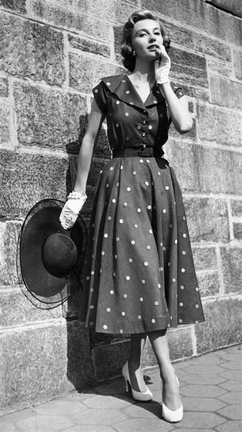
Fashion Through The Ages
Photograph from 1950


Evaluation/Reviewing Final Products
My aim was to create a poster for the event I had chosen which was a Dance event. When I was searching for different events I made a mind map with all the information and other events. On the other hand, I was doing a mind map I added pictures for all the events I had chosen. In the end, I decided to pick a dance event because it was my favourite event which made me happy and will inspire other people to do a similar event like this. My audience for the dance event was 17-25 years of age which will be suitable for people who are able to dance like hip-hop and jazz dance and make great routines.
I researched images from the Internet and I picked one where there were two dancers. One was jumping in the area and the other dancer was bending her body over the ball. I really like this image because I could recreate the images by using Illustrator. The tools I used when I was making my own version of the dancers were Pen tools, selection tools, a type tool, and an eyedropper tool to draw the images as my own to make it look like the original photographic poster. I also used my own image of myself in the middle for the photographic poster which is good research as part of primary research. My strength was when I was able to use more tools and draw the outline of the original image of the two dancers and copy the colours of the original photo to make it look like I had used my own colours and similar tones.
I have created a plan and I followed each step leading to the deadline. I was able to stick with the plan I created. And I wrote some notes down to always keep an updated. But I did an update of my new posters at the last minute.
I created my products in Photoshop and Illustrator for my final product. According to the plan, for Photoshop, I used many tools: gradient fill, text tools, shapes, color, and line tools text tools, color I used. However, the tools I used in Illustrator are the same similar tools "gradient fill, "Text tools", "eyedropper tools", shapes, and colours like blue and green. In the meantime, I was able to use these tools to create the successful poster that I wanted and I was able to achieve the outcome of the poster. I also made a new update to my posters and it turned out to be a positive result.
I made a form for my research both primary and secondary for my final product. I was able to create a Google form and it was the survey I did. I designed a questionnaire to influence my final product but I sent out the questionnaire very late.
I think I have problems and issues with this product because I created my first poster and I used the same color background. Even if, toward the end, I have to make a new update of my poster because I didn't realise that I had the original image background for my poster. So I improved the poster by taking a background image of my own to make it suit the main character blending in with the image.
I liked doing the product when I was able to make time to create my new posters and the image emerged to be what I wanted at the end after I was able to use the old poster and expand the process to make it look more creative and imaginative. I think I did the best of my ability to generate and complete the outcome of my product. I think i have complete the product by taking my time going over the work to see if i can make the result one step ahead to progress and appreciate the standard of my product.
I think the product went less well because i wasn't able to back up my plan if i was going to make changes to my posters for my event. this really slow me down and the social media header and posters was in a mess and the outcome didn't come out as what i wanted to be because there was only a photography in the middle with the classroom background at the back. i think i was stressed out doing the process because i think its may delayed the the whole plan because i have to start over again and bale to use the right background for the main picture. I was able to finish everything on time with a new version of my photographic and graphic poster and social media headers to meet the deadline.
If i want to repeat the process again i would change my event to a simple one like Eastenders or animals. If i have more time, i would pick east enders and pick good photos around the area of Albert square if they have given us more time like two to three months to gain information. I will able to make the progress with this event. If i want to make the same event again, i would maybe ask people if they dance or not.
No comments:
Post a Comment